CSS TRANSITION
Transition provides a way to control animation speed when changing CSS properties.CSS3 transitions allow you to change property values smoothly (from one value to another), over a given duration, you can cause the changes in a property to take place over a period of time. For example, if you change the background color of an element from white to black, usually the change is instantaneous. With CSS transitions property enabled, background color changes occur at time intervals that follow an acceleration curve, all of which can be customized.CSS transition very useful for CSS animations.
Implicit transitions are the animation that involves transitioning between two states as the states in between the start and final states are implicitly defined by the browser.

The transition property is a shorthand property that let you set the values of several other CSS properties simultaneously used to represent up to four transition-related longhand properties,
Example:
.class-name {
transition :: (transition-property)(transition-duration)(transition-timing-function)(transition-delay);-webkit- transition :: (transition-property)(transition-duration)(transition-timing-function)(transition-delay);
-moz- transition : (transition-property)(transition-duration)(transition-timing-function)(transition-delay); -o- transition : (transition-property)(transition-duration)(transition-timing-function)(transition-delay);
}
Lets discuss some properties
1) Transition Property
Specifies the name or names of the CSS properties to which transitions should be applied. The propertieswhich are listed here are animated duringcss transitions; changes to all other properties occur instantaneously as usual.If you want to animate each properties the use “All” instead of particular property name.
Example:
.class-1 {
background: red;
-webkit-transition: background-color(transition-duration)(transition-timing-function)(transition-delay);
-moz-transition: background-color(transition-duration)(transition-timing-function)(transition-delay);
-o-transition: background-color(transition-duration)(transition-timing-function)(transition-delay);
transition: background-color(transition-duration)(transition-timing-function)(transition-delay);
}
.class-1:hover {
background-color: blue;
cursor: pointer;
}
.class-2{
background: red;
color:black;
transition: all(transition-duration)(transition-timing-function)(transition-delay);
}
.class-2:hover {
background-color: blue;
Color:white;
}
In first, example, the only background color changes with the transition but in 2nd example transition applied on all properties.
2) Transition Duration:
Specifies the duration, how many milliseconds or seconds transition effect takes to complete. You can specify a single duration that applies to all properties during the transition, or multiple values to allow each property to transition over a different period of time.
Example:
.class-2{
background: red;
color:black;
transition: all 2s(transition-timing-function)(transition-delay);
}
.class-1:hover {
background-color: blue;
color:white;
}
In above example 2s a transition effect takes to complete.
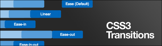
3) Transition Timing Function
Transition timing function specifies the speed curve of the transition effect.
The function determines how intermediate values of the transition are calculated.

Transition function value:
Ease: This is a default value for transition function. Transition start slow after that speed increases and again it slows down.
Linear: Transition start and end with same speed. The transition effect is consistent.
Ease-in: Transition effect starts with slow speed.
Ease-out: Transition effect end with slow speed.
Ease-in-out: Transition effect start and end with slow speed.
/* Standard syntax */
.div_1 {transition-timing-function: linear;}
.div_2{transition-timing-function: ease;}
.div_3{transition-timing-function: ease-in;}
.div_5{transition-timing-function: ease-out;}
.div_6{transition-timing-function: ease-in-out;}
4) Transition Delay
Defines how long to wait between the time a property is changed and the transition actually begins.
For the most part, the order of the values does not matter — unless a delay is specified. If you specify a delay, you must first specify the duration. The first value that the browser recognizes as a valid time value will always represent the duration. Any subsequent valid time value will be parsed as the delay.
Example:
<ulclass=”sidebar”>
<li><a class=”btn-list”href=”#”>Home</a></li><li>
<a class=”btn-list”href=”#”>About</a></li>
<li><a class=”btn-list”href=”#”>Contact Us</a></li>
<li><a class=”btn-list”href=”#”>Links</a></li>
</ul>
.btn-list{
position: relative;
transition-property: background-color, color;
transition-duration:1s;
transition-timing-function: ease-out;
text-align: left;
background-color: grey;
left:5px;top:5px;height:26px;
color: white;border-color: black;font-family: sans-serif;font-size:20px;
text-decoration: none;
box-shadow:2px 2px1px black;
padding:2px 4px;border: solid 1px black;
}
.btn-list:hover{
position: relative;
transition-property: background-color, color;
transition-duration:1s;
transition-timing-function: ease-out;
background-color:white;
color:black;
box-shadow:2px 2px1px black;
}
Rohit Pawar
Rohit Pawar is a professional Senior Web Designer. Holding an experience of 3 years in HTML | CSS | JQUERY | Photoshop